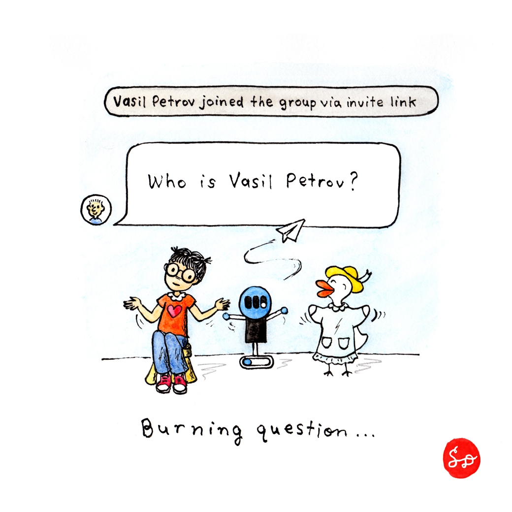
Money Button Telegram Group has a mysterious member who constantly joins and never participates. There is a lot of valuable Q&A, news, discussion, and support for Money Button happening on this Telegram chat. I am not a regular participant but I am a regular lurker! 😉
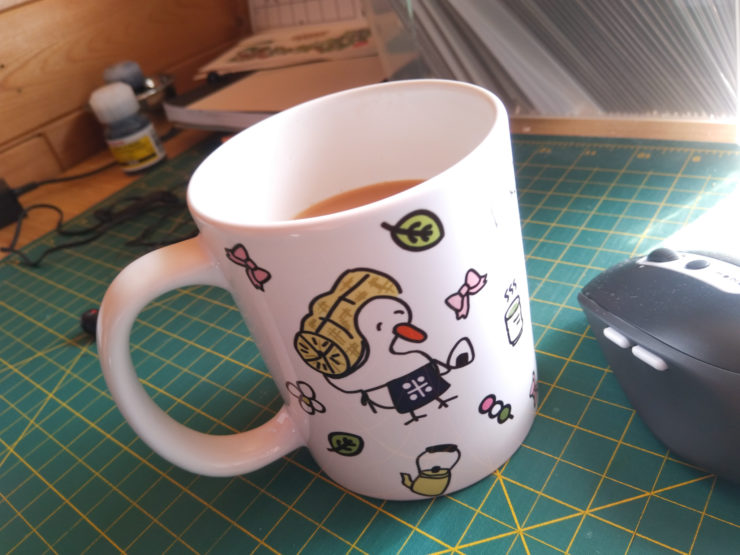
In contrast, there is another character called Satoshi Duckamoto who brings cheer to this group with BSV exclusive Telegram stickers which are sold at DuckCreation.com. The shop also sells a BSV decal and extremely cute mugs.
You can really tell when a business has empathy for its customers. How did this shop know exactly what I was looking for before I knew I needed it? I make an effort to purchase items to support the BSV economy but the last thing I want to look at is the Bitcoin ₿ on everything.

The absolute clincher was the Mama Duck illustration in which she is wearing almost the exact same smock/apron that my mom used to wear when deep frying tempura in the kitchen. I still miss my mom but I can think of her every time I use this coffee mug.
In business, it’s important to know your target customers’ wants/needs/desires. This mug hit a home run in both the functional (I am addicted to coffee) and emotional categories (nostalgia, therapeutic value, attractiveness). Bitcoin businesses that focus on providing multiple levels of value (from business to business, or business to customer) will probably have a better chance of succeeding. In short, don’t just be functional. Well, do focus on functionality first, but also consider the higher elements (emotional, inspirational, social-impact). I guess that’s where design (graphic, UI, UX) and marketing come into play.
[EDIT: After a good night’s sleep, I need to clarify that the functionality should be a given by the time you are presenting it to a customer. First, start with why. The WHY – your overarching purpose – will inform the how and what of your process.]
Money Button, Handcash, and Centbee are examples of Bitcoin businesses that understand what mass market consumers like and demand: products that work AND are a joy to use, because they are designed with care and attention to user experience, including aesthetics. They also provide responsive customer service, regular updates, and are willing to troubleshoot until issues are resolved, which is ultra important when you are dealing with people’s money.
When _unwriter release a new “thing”, he/she/they take(s) the time to explain and walk the readers/developers through the concepts and descriptions using specific but plain English. The documentation is designed with easy to follow headings. There is a recognizable name and icon (logo-like), which also makes it easier to feature in a doodle! Abstract concepts sometimes need a little illustration to help them stick in the brain.
Here is another “thing” made by @libitx, Preserve, that is a pleasure for even a normie non-coder to read and attempt to understand. I’m probably not going to the Github but at least the reader can get the basic gist of what’s going on here, due to the extra love that’s gone into writing up the description and designing this explanatory page.
I’m afraid I don’t remember where I encountered the following “Elements of Value” diagrams (probably from an email newsletter?) but this hierarchy is printed out and taped next to my desk:
The B2C Elements of Value (Business to Customer).
There is also a B2B version (Business to Business), for you smart people who are building on BSV.
I’m sorry that this blurb is all over the place, having migrated from Vasil Petrov to mugs to infographics.
Doodle is also posted on Yours.org.
